Project overview
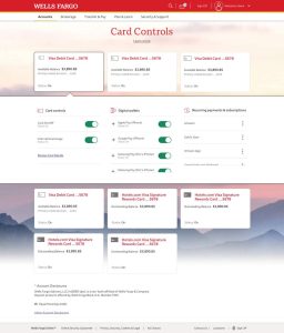
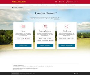
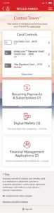
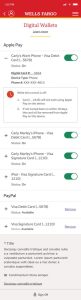
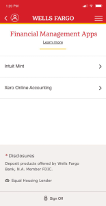
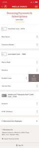
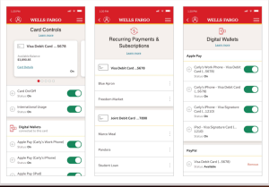
Wells Fargo Control Tower brings key aspects of customers’ digital financial lives into one centralized destination within online banking. The dashboard organizes card management, recurring payments, and data sharing into three clearly defined areas, helping customers understand their account connections and access the tools to manage them.
The experience pairs at-a-glance status summaries with direct management actions. Customers can see an overview of active, inactive, or blocked items before entering the relevant management experience, providing visibility without overwhelming the landing page with detailed settings.
My role as Lead Product Designer
I led the design of the desktop dashboard, translating a broad set of financial management capabilities into a clear, approachable experience. My focus was on establishing the information hierarchy, organizing the core functionality, and creating straightforward paths from account overview to action.
I developed a consistent card-based layout that gives each management area a recognizable icon, supporting context, a status summary, and a prominent call to action. This shared structure makes the dashboard easy to scan while giving cards, payments, and data-sharing controls a cohesive presentation within Wells Fargo’s visual identity.
A central design priority was balancing visibility with simplicity: surfacing enough information to orient customers while reserving more detailed controls for the individual management experiences. The dashboard was designed to give customers a clearer understanding of their digital financial connections—and a more direct way to manage them.