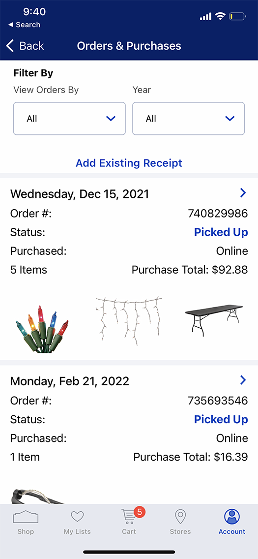
🤔 Problem


The Lowe’s app’s Order History screen was starting to feel… old. Our product partners wanted to refresh the design and optimize the content in a way that prioritized the most relevant information to the customer. The design was not easily scannable due some disjointed labeling and the Add Existing Receipt (which is the most tapped action on the screen after the order tiles) felt shoehorned in. The spacing, typography and overall hierarchy also did not feel like it lived up to our customers expectations.

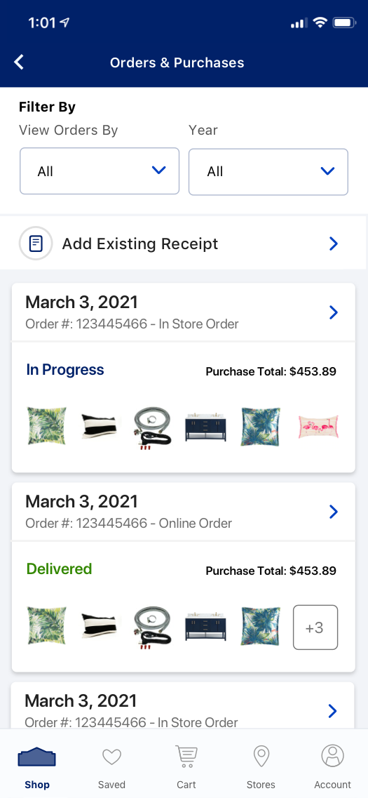
😃 Solution


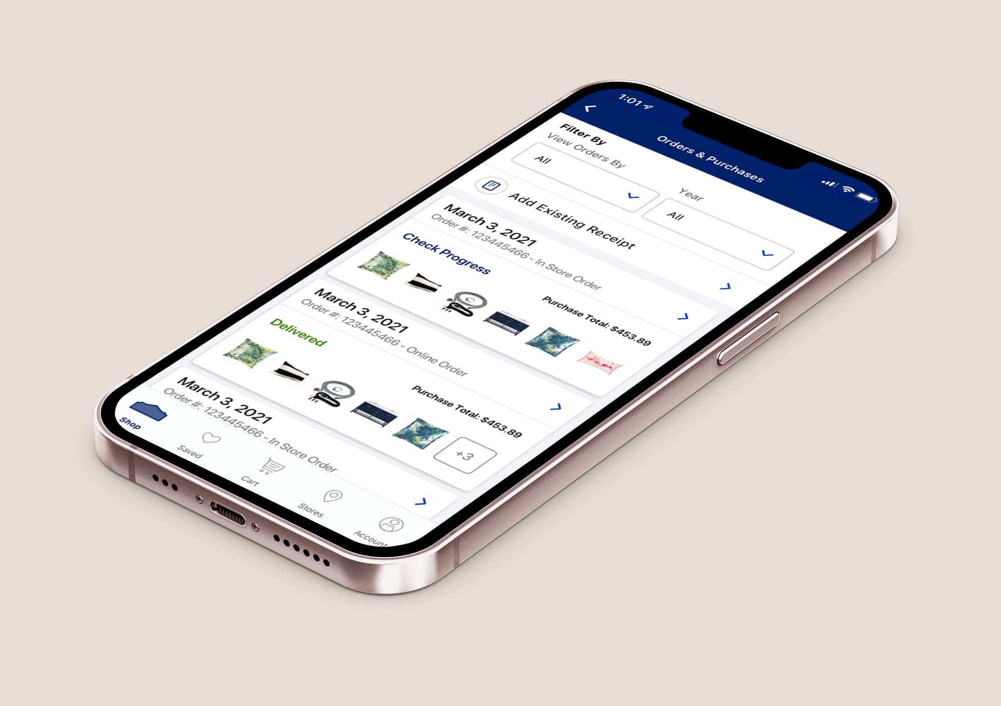
We conducted user testing to determine which pieces of information were most important to our customers and decided to enlarge the purchase date and align the order status and purchase total with the product images and remove redundant labeling in an effort to best align with our customers mental models. We then placed the order cards in more obviously tappable tiles, and beefed up the Add Existing Receipt button by adding an icon and larger tap area. The end result is clean, modern experience, that tested much higher than the existing pattern.