Project overview
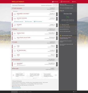
This initiative modernized Wells Fargo’s signed-in banking experience, creating a cleaner, more consistent interface across desktop, tablet, and smartphone. The goal was to reduce visual clutter, improve access to essential account information, and bring the experience into closer alignment with Wells Fargo’s public-facing website.
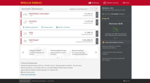
The work included account-summary experiences for customers with different numbers and types of accounts, along with self-service capabilities such as online account closure. A shared component library supported consistency across devices and provided a foundation for future design and development.
My role as Lead Product Designer
I joined the redesign in 2014 and led design work across account-management experiences, translating usability findings and business requirements into information hierarchy, responsive layouts, and interaction patterns.
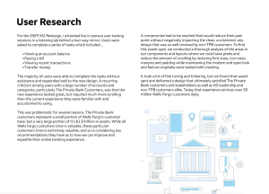
I observed in-person usability sessions in which customers checked balances, reviewed transactions, paid bills, and transferred money. Although most participants completed these tasks without assistance and responded positively to the visual direction, testing revealed an important tradeoff: customers with many accounts—particularly Private Bank customers—needed to scroll substantially more than they were accustomed to.
I helped resolve that tension by refining typography, icon sizing, margins, and component spacing to increase information density without sacrificing clarity. The account-summary layouts supported both straightforward account lists and more complex, categorized views, keeping balances and account-level actions consistent across each.
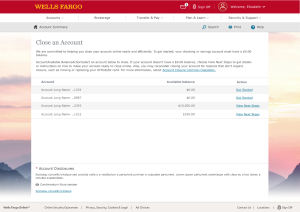
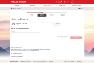
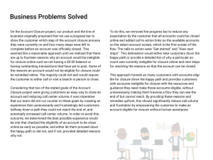
For online account closure, I helped challenge the assumption that every customer could follow the same linear process. Eligibility restrictions meant some accounts required additional steps—or assistance outside the website—before they could be closed. A fixed progress indicator risked suggesting that online completion was possible when it was not.
I helped reshape the experience to surface eligibility at the beginning rather than reveal barriers midway through the flow. We removed the progress bar and introduced distinct actions at account selection: “Get Started” for eligible accounts and “View Next Steps” for accounts requiring additional preparation. This gave customers a relevant path forward without asking them to navigate a process they could not complete.
Design outcome
The work balanced visual simplicity with the needs of customers managing complex account relationships. It also made account-closure guidance more explicit, supporting the goals of easier self-service and fewer avoidable support calls.
My contribution went beyond a visual refresh: I used research to refine the balance between spaciousness and efficiency, and helped reframe a consequential banking workflow around customer readiness rather than a predetermined sequence of screens.