Project overview
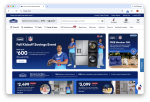
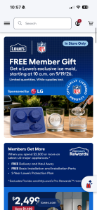
The Lowe’s global masthead redesign transformed a highly visible part of the shopping experience into a clearer, more adaptable system for search, product discovery, and access to essential shopping tools. The project replaced the previous header with a more intentional hierarchy connecting department navigation, services, promotions, store selection, delivery location, and account actions across desktop and mobile.
The scope extended well beyond a visual refresh. As a shared entry point across the website, the masthead influences how customers find products and how different parts of the business gain visibility. Every placement decision needed to balance customer utility, commercial priorities, and limited screen space.
My role as Lead Product Designer
I took ownership of the masthead design strategy, leading the information hierarchy, navigation patterns, and responsive interaction design while aligning more than 80 stakeholders with competing business-unit priorities.
A central challenge was ensuring that individual requests for visibility did not collectively create an overwhelming experience. I used heat map analysis to assess how customers interacted with the existing masthead and competitive analysis to evaluate alternative approaches to search prominence, category navigation, and the organization of shopping tools.
These inputs gave stakeholders a shared foundation for decision-making. Rather than allowing the conversation to center on which business unit should receive the most prominent placement, I helped redirect it toward customer behavior, discoverability, and the tradeoffs of adding more content to a shared interface.
I translated that evidence into a hierarchy that accommodated different business needs through distinct navigation layers. The goal was not to give every destination equal prominence, but to give each an appropriate, discoverable place without compromising the primary shopping journey. This helped move a highly visible, cross-functional initiative toward a coherent solution rather than a collection of competing requests.
Design approach
I separated utility and promotional links, primary shopping controls, and department navigation into clearly defined layers. Search remained a central action, while store and delivery information were grouped together to make fulfillment context more apparent.
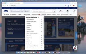
The redesigned category bar exposes direct paths into key departments and services. Structured dropdowns provide access to deeper categories without displaying the entire catalog at once, supporting both customers who know where they want to go and those browsing the assortment.
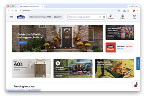
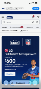
I also designed expanded and condensed masthead states across desktop and mobile. The expanded experience supports orientation and discovery, while the condensed state preserves essential actions as customers scroll and returns more screen space to shopping content. On mobile, this required prioritizing search, menu access, account, and cart rather than simply shrinking the desktop layout.
Impact
The project’s reported results included a 34-basis-point increase in traffic to product listing pages and a 1-basis-point increase in conversion rate.
Beyond the interface, the work established a shared direction for one of the website’s most contested spaces. My contribution combined hands-on design with evidence-based prioritization and stakeholder alignment—balancing the needs of individual business units with the clarity and consistency of the overall customer experience.